Maribyrnong Libraries
Building a brand that brings people together
Maribyrnong Libraries needed a flexible visual system for the huge range of programs, events and services they communicate every day.
Working within Maribyrnong City Council’s existing brand, Studio Hibiscus developed a warmer, more playful library identity that could work across print, digital and physical spaces.
One library, many audiences
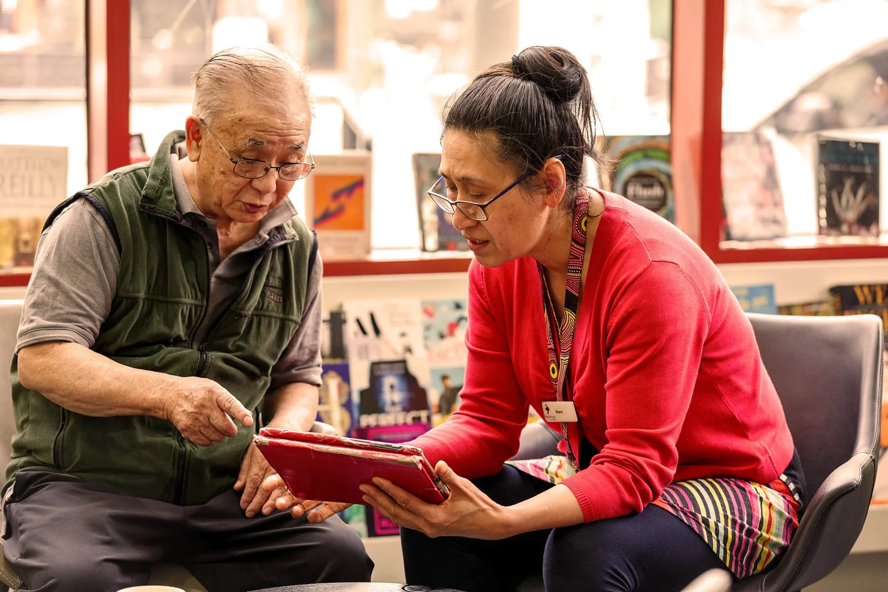
From children’s programs and book clubs to digital services, events and community information, the library communicates with people of all ages and backgrounds.
The challenge was creating a system that could accommodate very different content while still feeling recognisably Maribyrnong Libraries.
Extending the Maribyrnong identity
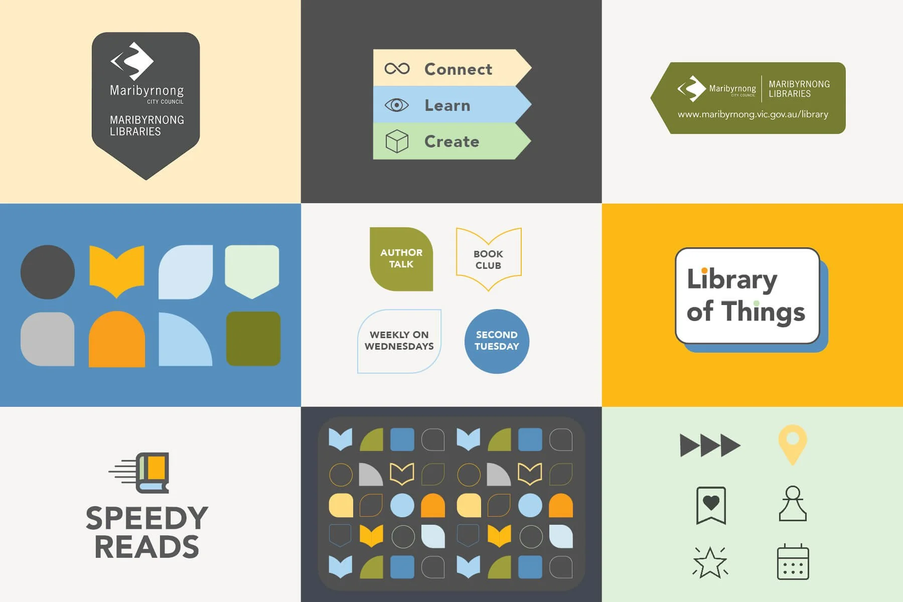
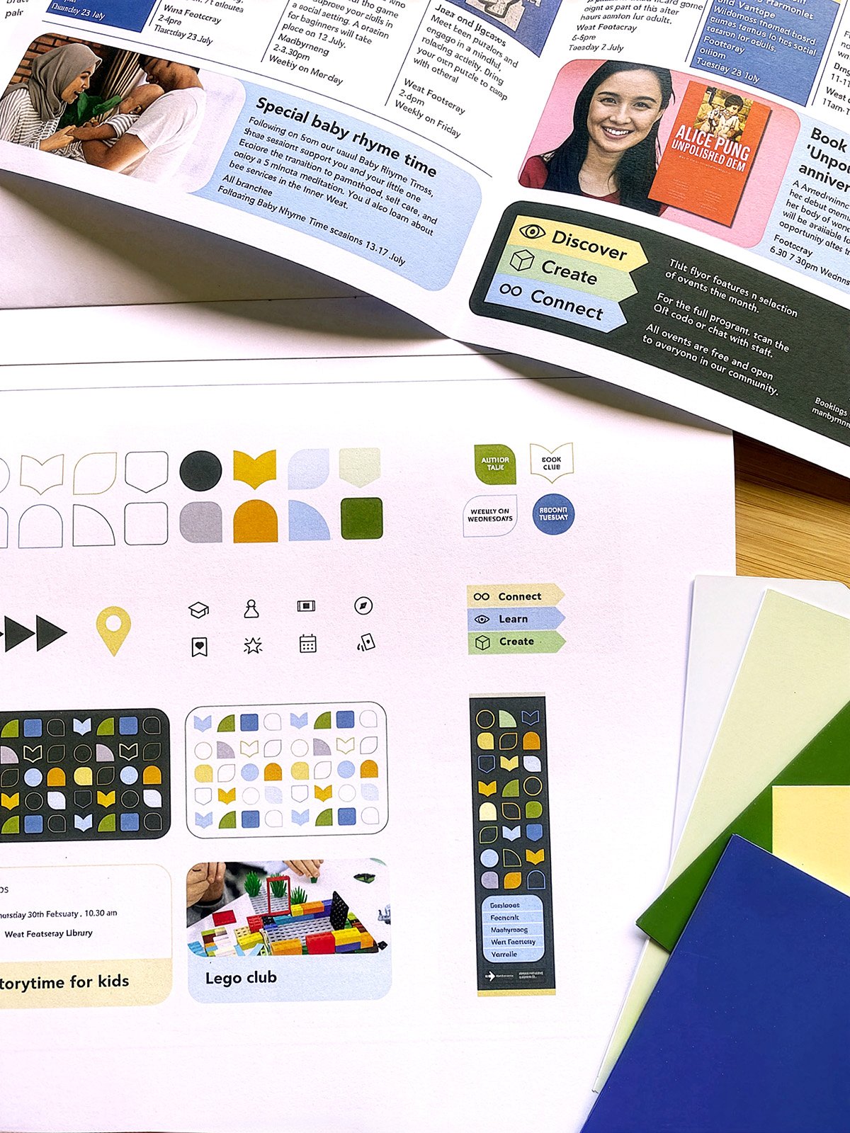
Using Maribyrnong City Council’s brand rules, I built the library identity on the existing fonts and colours.
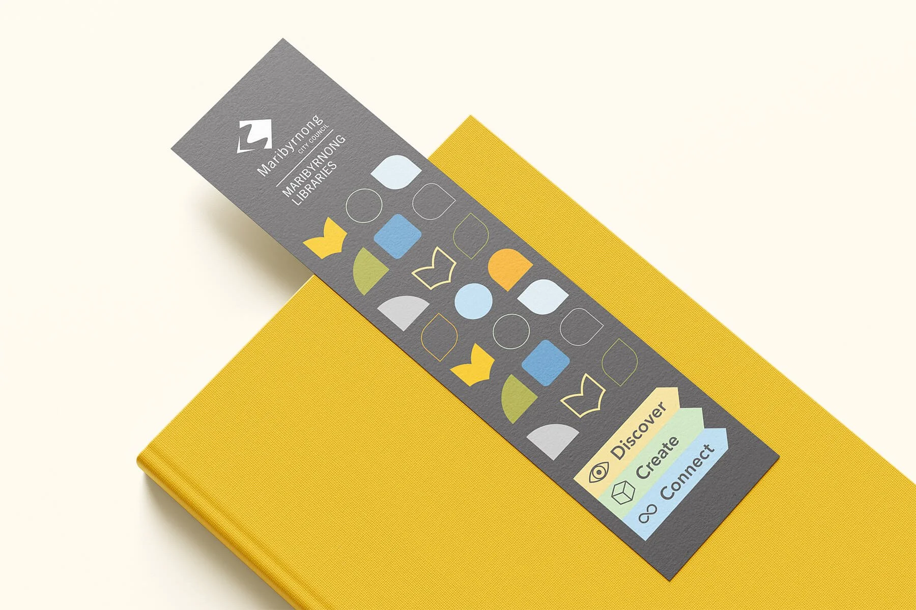
I then added geometric shapes inspired by books, a custom icon set, illustrations, patterns and program badges.
Colour combinations were tested for accessibility and legibility across print and digital applications.
These elements gave Maribyrnong Libraries a distinct personality while staying linked to the Council brand.
Illustrations with personality
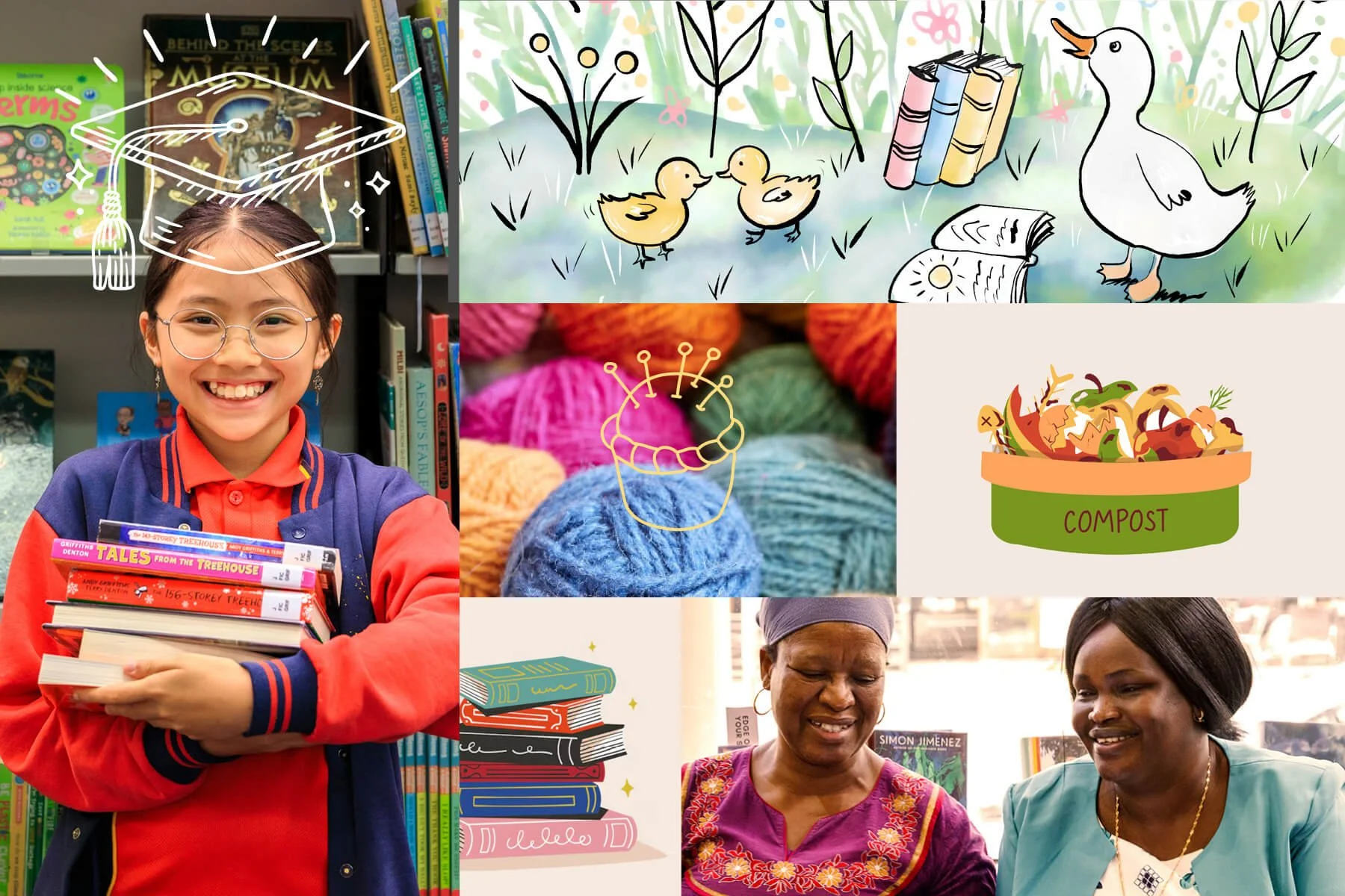
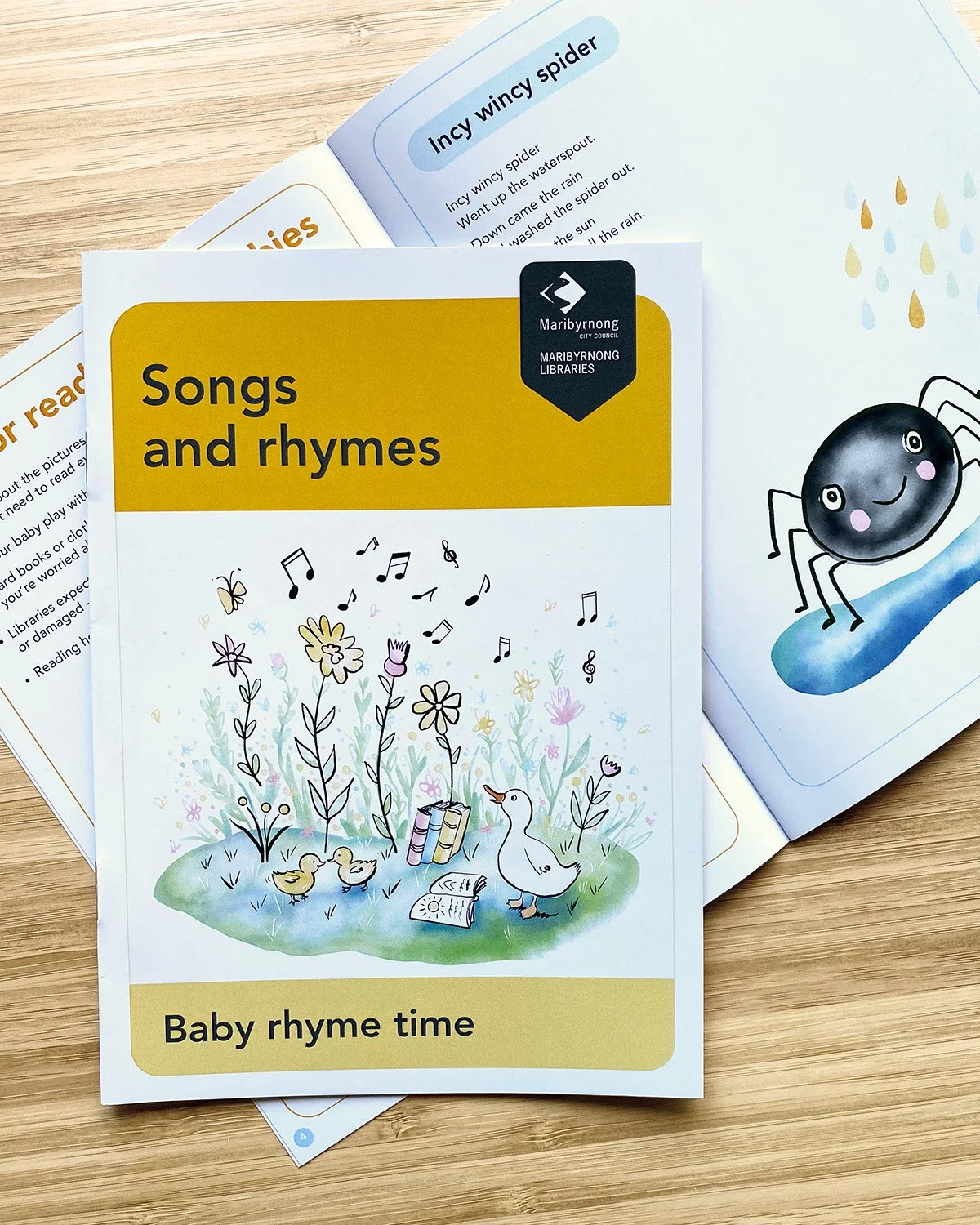
Custom illustrations give children’s programs, reading initiatives and events their own distinctive character.
From bookmarks to banners
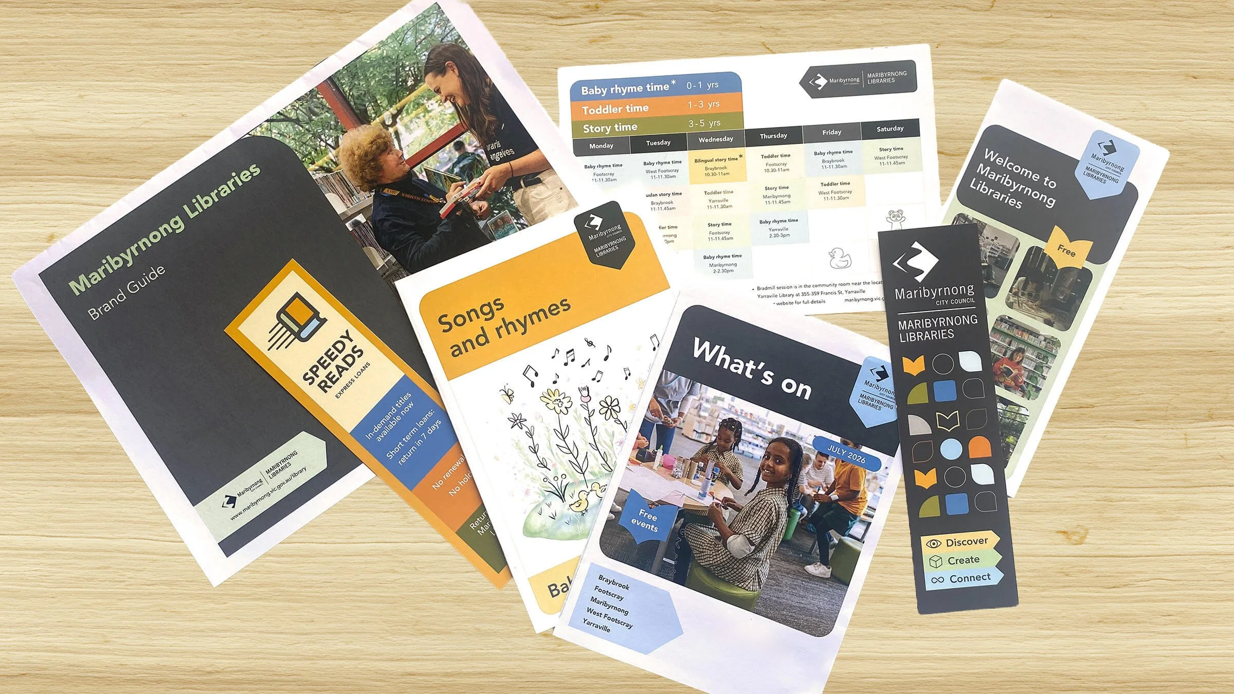
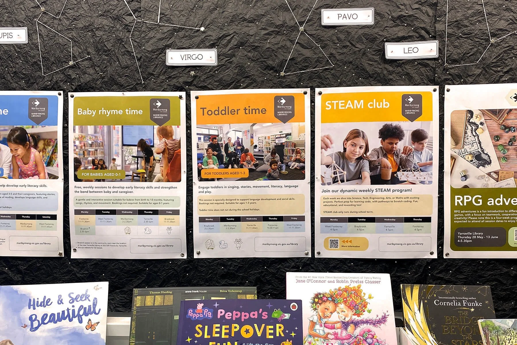
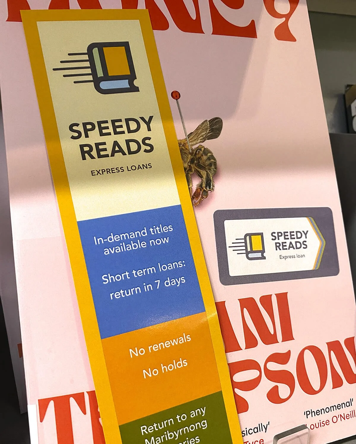
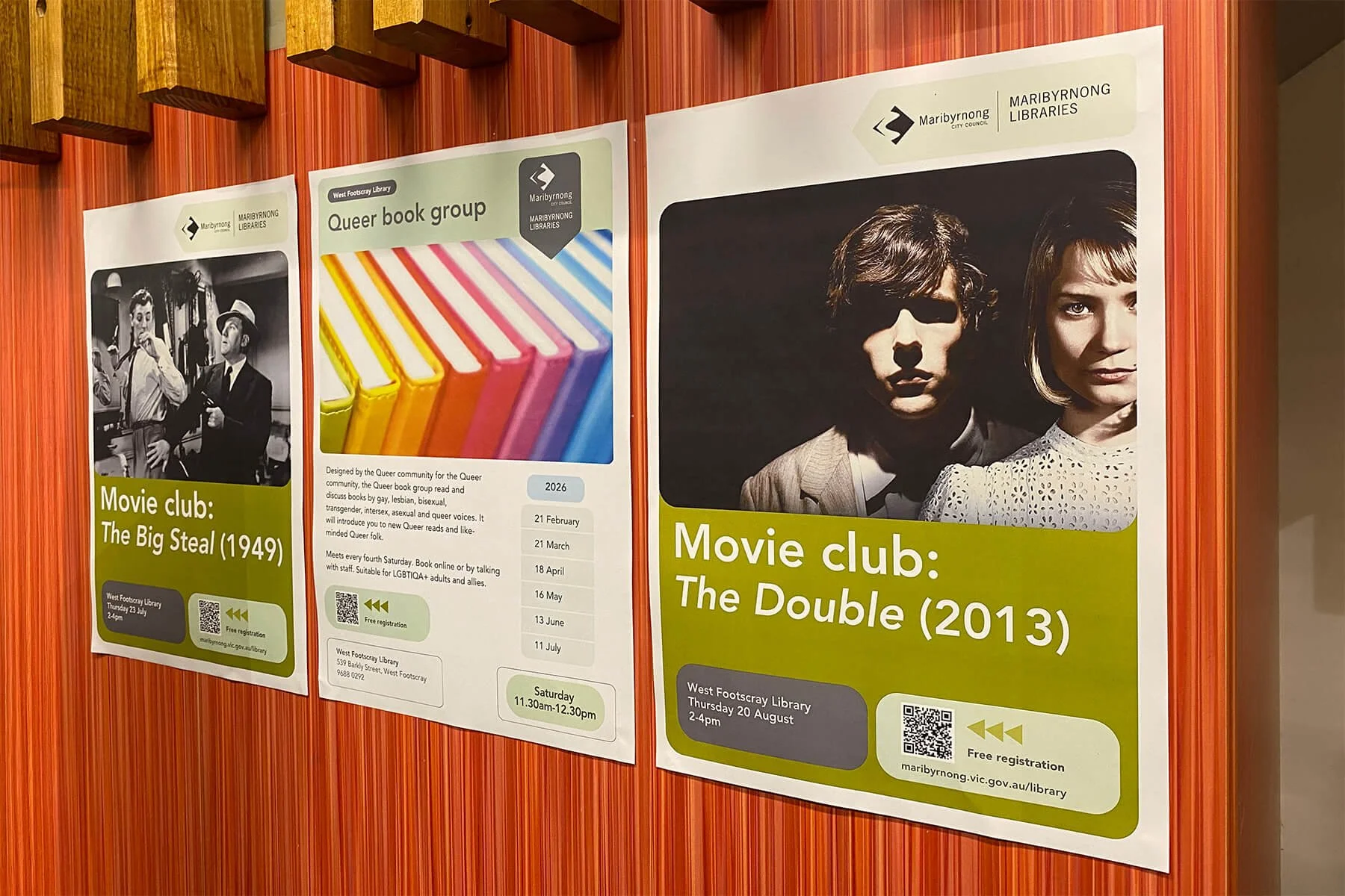
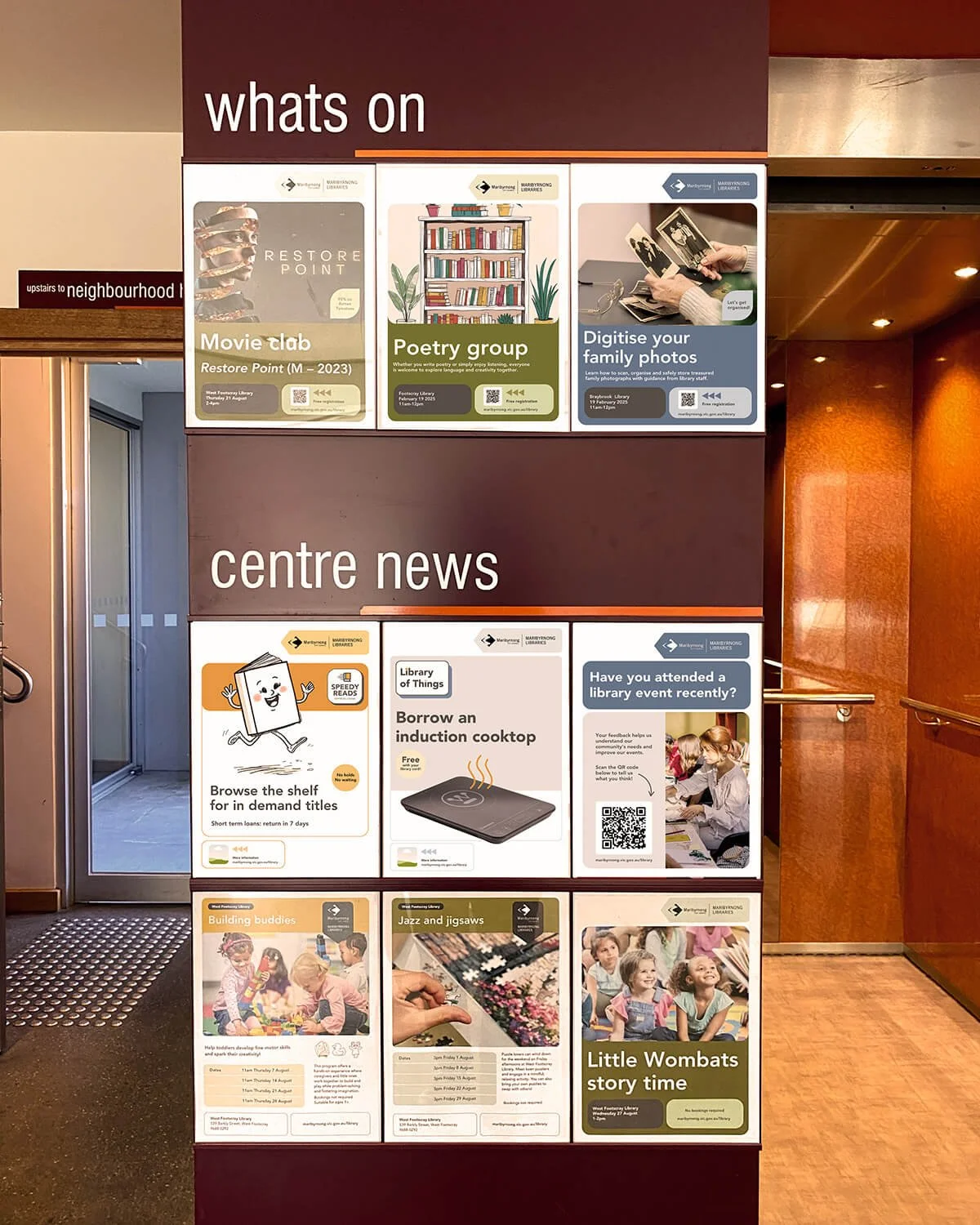
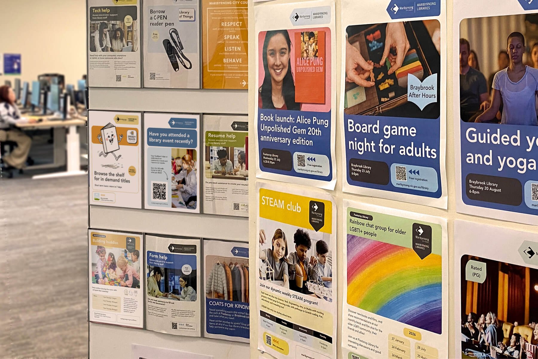
The identity was applied across everything from bookmarks, posters and monthly programs to large-scale library displays - creating consistency without making every communication look identical.
Designed for digital
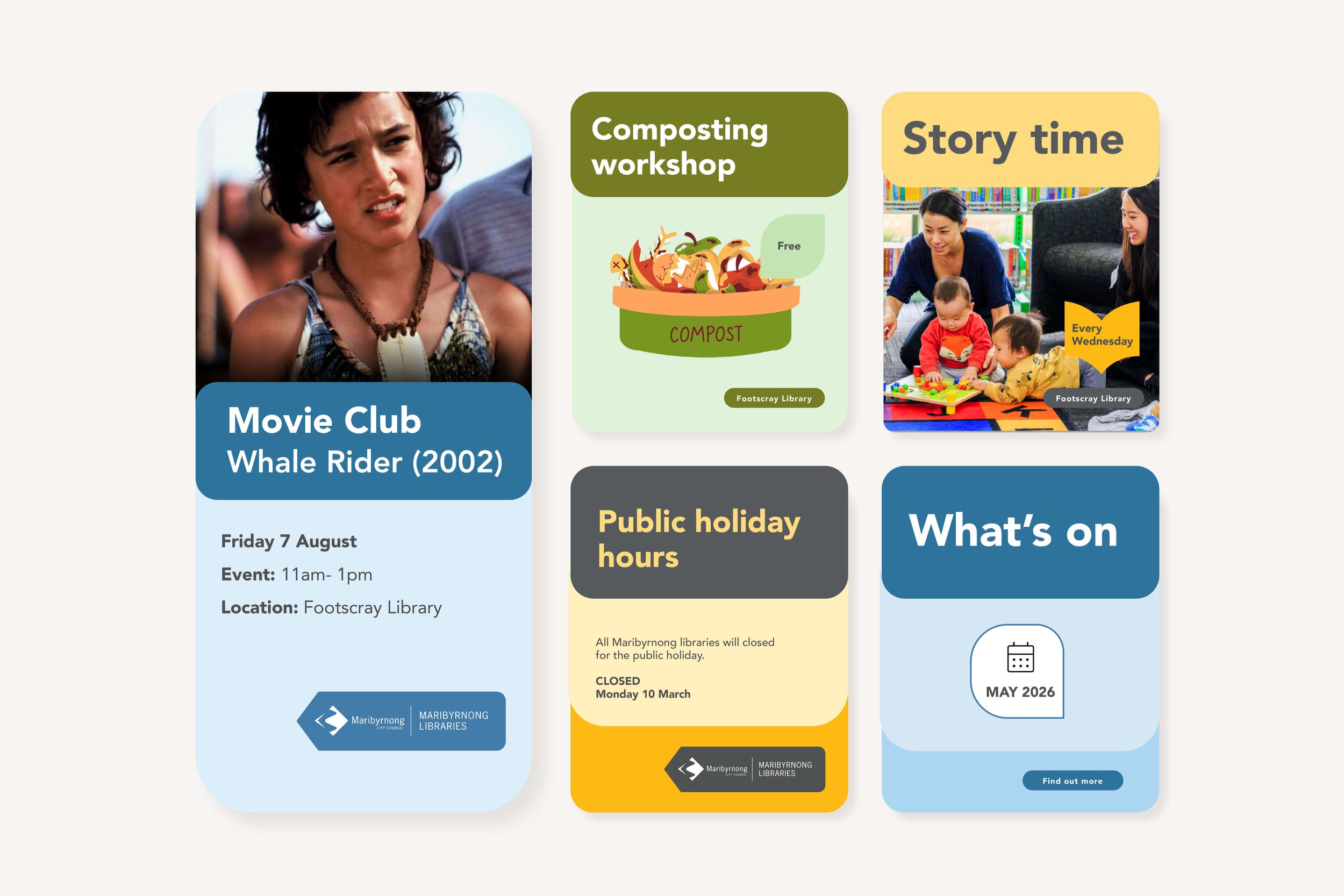
Social media templates make the library branches communication look consistent and recognisable across online channels.
From identity to environment
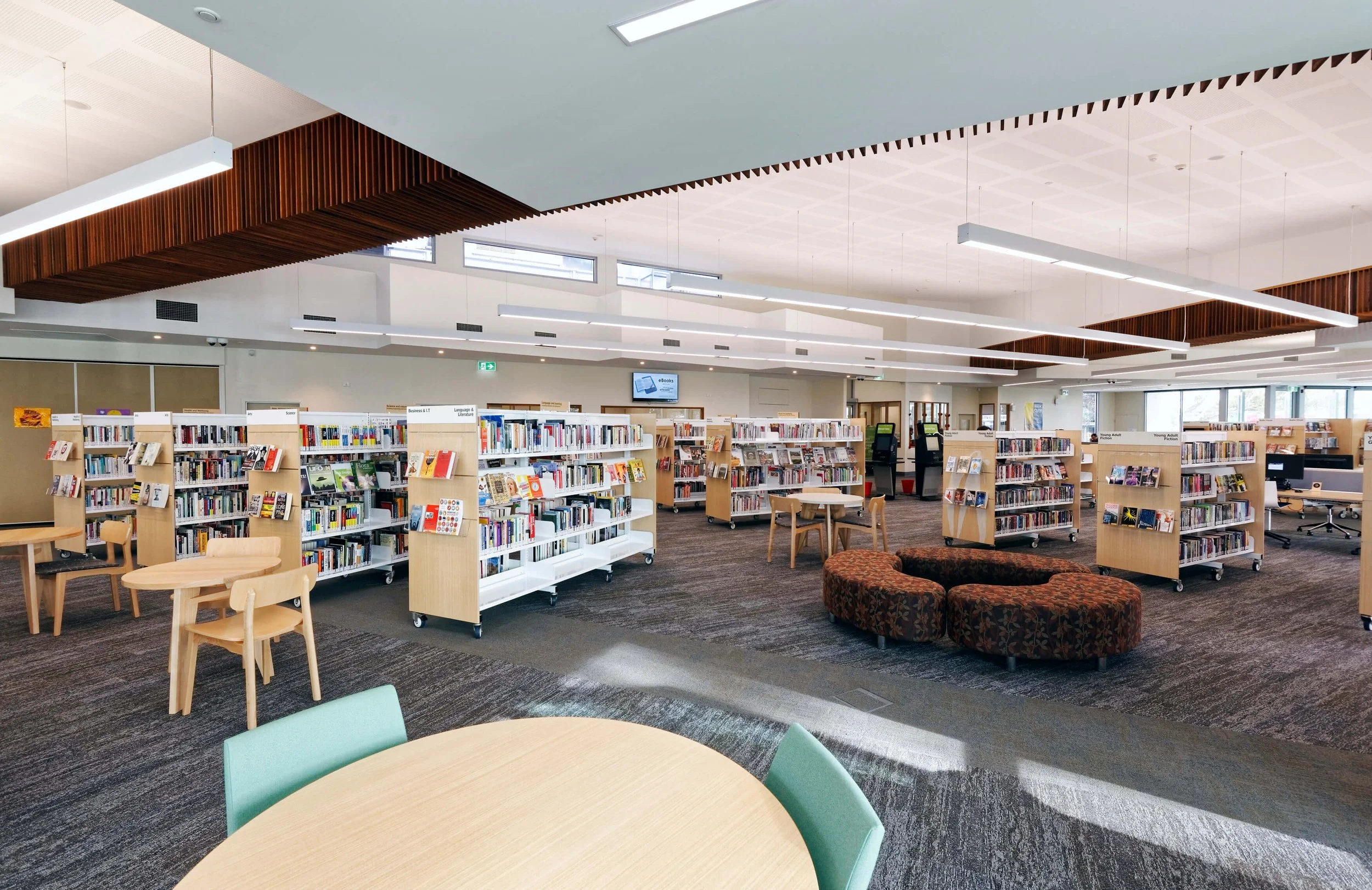
Across the library branches, the new identity makes programs, services and events easier to see and recognise.
Designed for real life