LOGO & WEBSITE DESIGN
Maevcon Construction
The logo for Maevcon was designed in close collaboration with Alex from Maevcon, incorporating the letters MAE to represent his children's initials. This personal touch sets the foundation for the brand's identity.
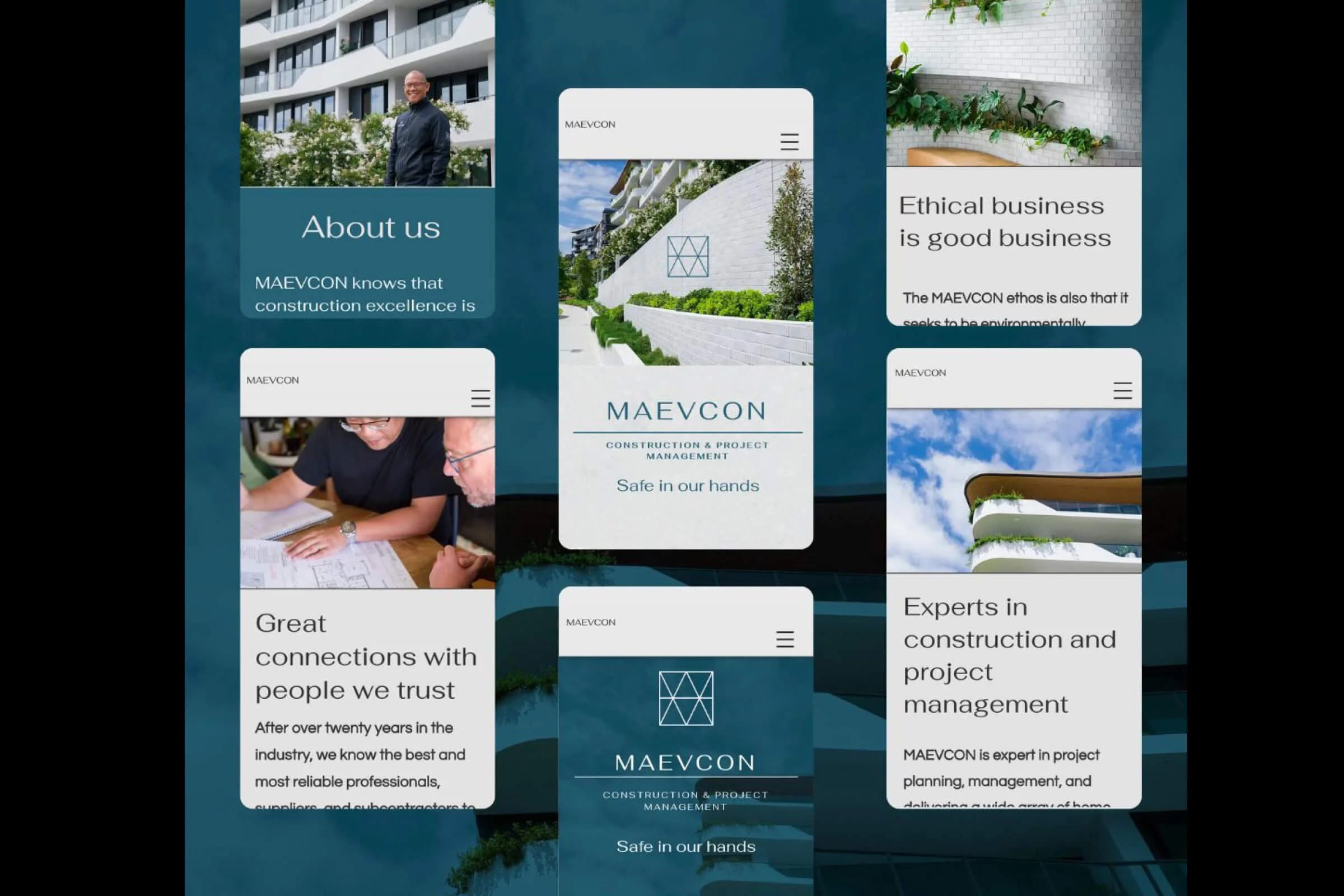
A great website isn't just about aesthetics though—it’s about the quality of the elements within it. This includes clear, well-crafted copy and high-quality images.
I collaborated closely with Matthew (aka Mr Hibiscus) to develop snappy, concise wording that effectively communicates Maevcon's services, all while reflecting the company’s core values.
I art-directed the on-location shoot alongside Yusuke Sato Photography, who delivered professional and visually stunning images.
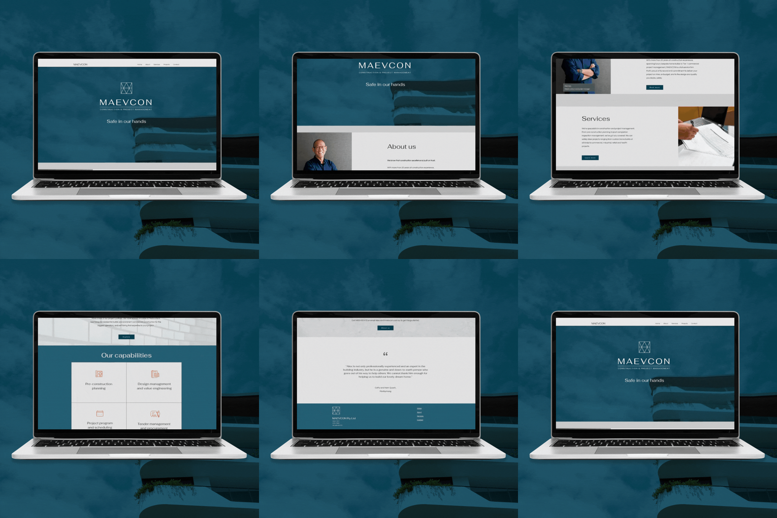
By combining all these elements, I was able to design a website that has excellent visual appeal and high-quality content, intuitive navigation, and strategic SEO. The result is a site that functions seamlessly across both desktop and mobile platforms.


