
A community identity grounded in people and place
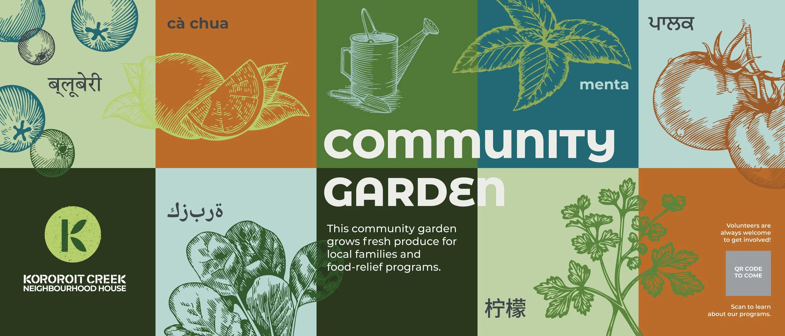
A warm, flexible identity for Kororoit Creek Neighbourhood House, reflecting its focus on community, sustainability and wellbeing.
A neighbourhood house with many roles
Kororoit Creek Neighbourhood House is a community hub in Albion, offering programs, activities and opportunities for local people to connect.
The identity needed to bring its varied communications together while reflecting the organisation’s strong connection to community and the local environment.


Recognisable, without feeling corporate
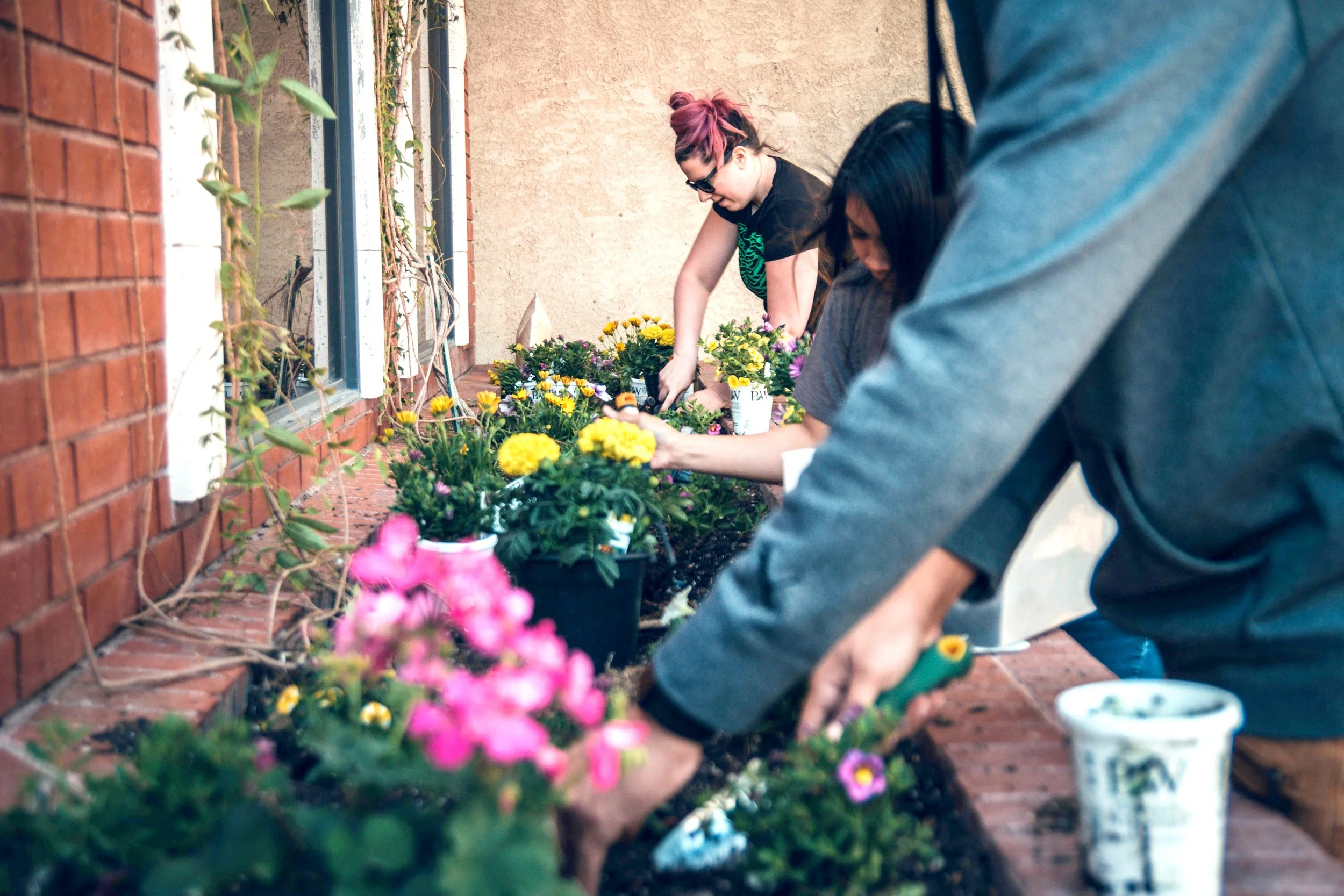
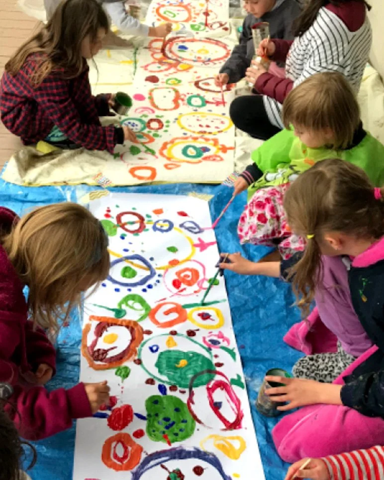
The house communicates with a broad community across everything from workshops and events to gardening, repair and sustainability programs.
The new identity needed to be easy to recognise and use, while retaining the friendly, informal character of a neighbourhood house.


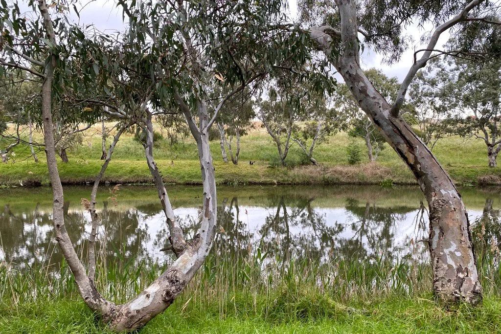
Inspired by Kororoit Creek
A simple K leaf symbol became the starting point for the identity, connecting the organisation’s name with its environmental values.
A natural colour palette, hand-drawn illustrations and a combination of serif and sans serif typography create a friendly visual language that can shift between playful and practical.


Illustration with a human touch
A collection of hand-drawn illustrations adds personality to the identity, representing community activities, nature, learning and everyday neighbourhood life.

Made for everyday use
The identity was designed to work across the organisation’s day-to-day communications — from social media and newsletters to posters, signage, merchandise and the website.
The result is a flexible system that feels distinctly Kororoit Creek Neighbourhood House and can continue to grow with the community.
